
On this page
Watermark Examples: 14 Styles at a Glance
These watermark examples are all on real photos, and each one is set up the way a careful photographer would set it up: a sensible size, the right opacity, a font that suits the work and a shadow where the photo needs one. Every name and brand in them is invented.
They fall into three families, depending on what the watermark is for:
- Credit marks (corner name, © and year, website, signature) say who took the photo and stay out of its way. Use them on social posts and portfolios.
- Brand marks (logo with a name, monogram, badge, name with a tagline) make every photo look like part of one business.
- Protective marks (centered, diagonal, tiled, PROOF) cover the subject, so the photo is hard to use without you. Use them on previews, proofs and anything you sell.
- Any style only works if it reads on the photo: dark on bright scenes, white on dark ones, and a soft shadow on busy ones.
Subtle Credit Marks
Most watermarks on photos shared online are credit marks. Their job is to answer "who took this?" for anyone who sees the photo, without competing with it. They are small, sit near an edge, and are usually white with a soft shadow.

Small corner text is the classic photography watermark. A clean sans-serif in capitals with extra letter spacing looks considered rather than typed, and a soft shadow keeps it readable over trees and water. Use it on landscapes and portfolio images where you want credit and nothing more. It is also the easiest mark to crop off, so it is a signature, not a lock.

© year and name follows the order of a formal copyright notice: the symbol, the year of first publication and the owner's name. It reads as "this is copyrighted" at a glance, which suits wildlife and editorial work that often gets copied. Centered along the bottom, it feels balanced on a calm photo like this one. For the exact wording, see what to write in a watermark.

A website address turns the watermark into a signpost. It works best for travel bloggers, food bloggers and anyone who wants a shared photo to lead people back to them. Drop the "www" and "https://", keep it lowercase, and give it a slightly stronger shadow than a name would need. Over a busy, colorful photo like this one, the shadow does most of the work.

A signature watermark feels personal, which is why portrait, wedding and fine art photographers like it. Script needs more size than block capitals, because the thin strokes disappear when the photo is shrunk. Choose a script that stays readable, such as Great Vibes or Sacramento, rather than a scrawl nobody can decipher. More in signature watermarks.
Brand Marks: Logos, Monograms and Badges
Once photography is a business, the watermark is also branding. These styles take more effort to set up, but they make every photo you post look like it came from the same studio.
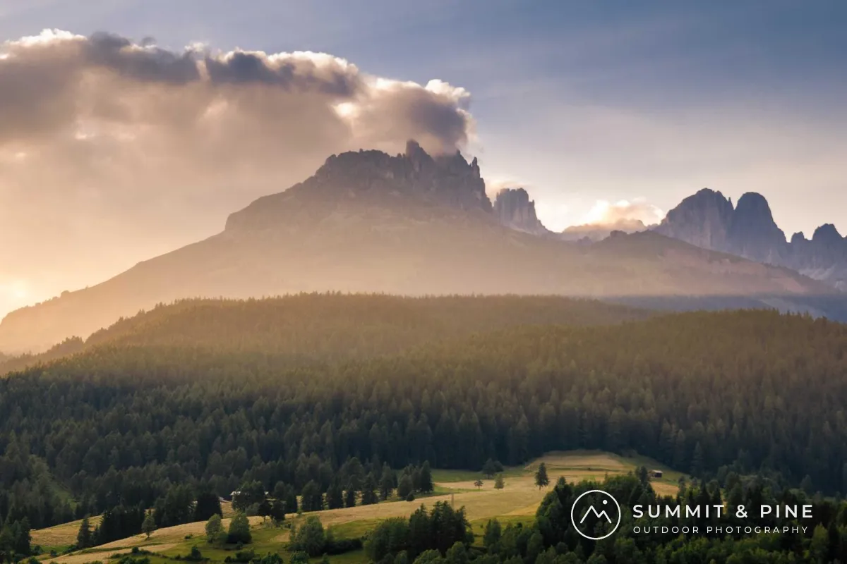
A logo with a name pairs a small icon with the business name and a short line about what you do. The icon is what people remember; the name tells them what to search for. Keep the icon simple and in one color, because a detailed full-color logo looks like a sticker on a photo. If you are deciding between the two, see logo vs text watermark.

A monogram is the most compact brand mark there is. Two initials in an elegant serif, framed by a thin ring, sit comfortably in a corner of a flat lay or product shot without needing space for a full name. It suits food blogs, small shops and studios with a short name. Use it where people already know the brand; strangers cannot look up a pair of initials.

A badge sets the name around a circle, like a stamp or a seal. It has a crafted, vintage feel that suits boats, workshops, coffee and travel. Place it over a quiet patch, here the dark water, because its fine lettering gets lost on detail. Badges are usually designed once as a transparent PNG and added as a logo watermark.

A name with a line and a specialty is a text-only way to look like a brand. The name is set larger, the specialty much smaller and wider spaced, and a short thin line between them holds the two together. It suits architecture, interiors and real estate, where a tidy, graphic look matches the photos. Here it sits on the dark base of the wall, where white reads cleanly.
Most of these brand marks rely on type. For fonts that hold up when photos are shrunk, see the best fonts for watermarks.
Protective Watermarks for Photos You Sell or Send
A corner mark can be cropped off in seconds. When the photo itself is what someone might take, such as a print you sell, a stock image or a client proof, the watermark has to cross the subject. The trick is to make it large but faint.

A centered, faint watermark crosses the most valuable part of the photo, so no crop removes it, yet stays light enough that the photo still comes first. Wildlife and portrait shots with one strong subject suit it well. Spread the letters wide and keep the opacity around 30–40%.

A diagonal watermark runs from corner to corner, so it covers the whole photo with a single copy. The angle keeps it from lining up with horizons and walls, which makes it harder to clone out. On a bright, sunlit photo like this one, a dark color at low opacity reads better than white.

A tiled watermark repeats a short mark across the entire photo. There is no clean area left to crop, and removing it means repainting everything. It is the standard for stock previews and product photos that could be resold. Keep the text short and the tiles small and faint. Tiled watermarks covers spacing and angle in detail.
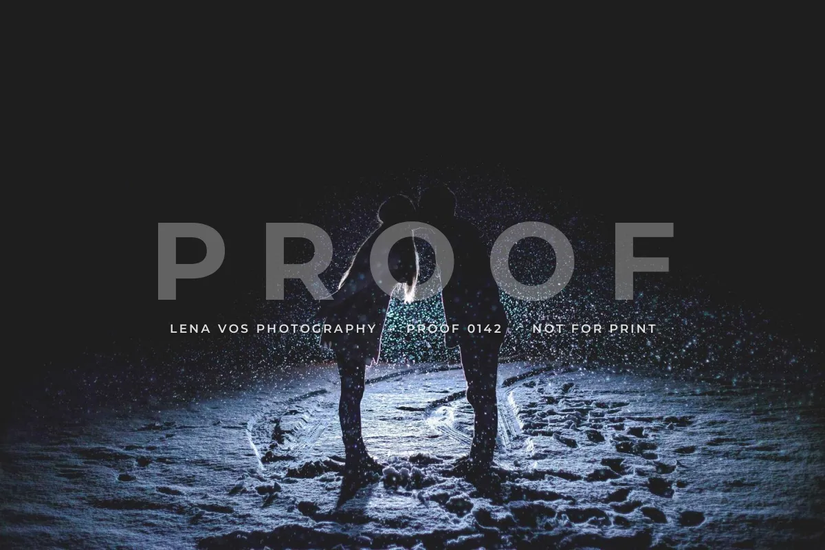
A PROOF overlay tells clients exactly what they are looking at: a preview to choose from, not a finished file. The large word does the protecting; the small line underneath carries your name and a proof number, which makes it easy for the client to say which photos they want. It belongs on wedding, portrait and event galleries sent before payment.
Make Any Style Read on the Photo
The same watermark can look professional on one photo and vanish on the next. Two adjustments fix most of it.


Match the color to the background. White is the default, but on snow, sand, sky or a sunlit sidewalk it fades away. A charcoal or near-black version of the same mark reads instantly. Keep a light and a dark version of your watermark and use whichever contrasts with the spot where it lands.


Add a soft shadow on busy photos. When the background changes from light to dark under the letters, no single color works everywhere. A soft, slightly blurred shadow gives every letter an edge, so white text holds up over crowds, foliage and patterned surfaces. Keep it soft: a hard, offset shadow looks dated.
Position matters as much as color. Put the mark on the calmest part of the photo, or across the subject when you need protection. Where to put a watermark compares the options.
How to Choose a Watermark Style
Start from what the photo is for, then pick the style that matches how much protection it needs.
| The photo is… | Good styles | Why |
|---|---|---|
| A social media post | Corner text, website, signature | It is promotion: credit matters more than protection. |
| A portfolio image | Corner text, signature, small logo | People are judging your work; keep the mark out of the way. |
| A blog photo | Website, logo with name | Shared copies lead readers back to you. |
| A product or food photo | Monogram, logo, light tiling | Branded and harder to reuse in someone else's listing. |
| A print or stock preview | Tiled, diagonal | The clean file is what people pay for. |
| A client proof | PROOF overlay, tiled | Clients can choose photos but not use them. |
| A wildlife or news photo | © year and name, centered faint | These are copied often; a clear notice helps. |
- Use one style consistently across a set of photos.
- Keep a light and a dark version of the same mark.
- Size script and thin fonts larger than block capitals.
- Cross the subject when the photo is the product.
- Check the mark on a phone-sized preview before exporting.
- Use a full-color, detailed logo as a watermark.
- Combine a signature, a logo and a website on one photo.
- Push opacity up until the mark is the first thing people see.
- Rely on a corner mark to protect photos you sell.
- Put white text on snow, sand or bright sky.
Make These Watermark Examples in Watermark.ws
-
1
Upload your photos
Add one photo or a whole batch. Watermark.ws also handles PDFs, Word documents, GIFs and videos.
-
2
Add a text watermark, a logo, or both
Type your name, © line or website, or upload your logo, monogram or badge as a PNG. Each one can be positioned separately.
-
3
Style it
Choose a font from the preset library or upload your own, then set the size, color, letter spacing, rotation and opacity. Add a shadow, stroke or background band for busy photos.
-
4
Tile it for protection
Turn on Tile to repeat the mark across the whole photo, and set the spacing between copies.
-
5
Save it as a template
Save the finished design so every future batch gets the same watermark in one click. A light and a dark template cover most photos.
Sample photos: Fjord by Larry Chen, Deer in fog by Paul Earle, Cliffside village by Jonas Lavoie-Levesque, Meadow portrait by Julia Caesar, Mountains by David Marcu, Kitchen flat lay by Todd Quackenbush, Sailing boat by Martin Wessely, Yellow house by Padurariu Alexandru, Lioness by Samuel Scrimshaw, Island rooftop by Anthony DELANOIX, Grapes by Maja Petric, Couple in snow by Greg Rakozy, Mother and daughter by London Scout, Train station by Nicolai Berntsen on Unsplash.