On this page
Measure Size Against the Photo, Not in Pixels
Ask how big a watermark should be and you will often hear a number in pixels. The trouble is that pixels mean nothing without the size of the photo. A watermark 240 pixels wide is a fifth of a 1,200-pixel photo — and a twentieth of a 4,800-pixel one.


Both photos are shown here at the same size, the way a viewer would see them on a screen. On the high-resolution photo the “same” watermark has shrunk to a speck. That is why every size in this article is given as a share of the photo’s width: it looks the same whether the photo came from a phone or a 45-megapixel camera.
You size a watermark on the preview in the editor. When you download, it is scaled up by the same factor as the photo underneath it, so a watermark that covers a quarter of the preview covers a quarter of the full-resolution file — along with its distance from the edge and any tile spacing.
One Watermark, Four Sizes
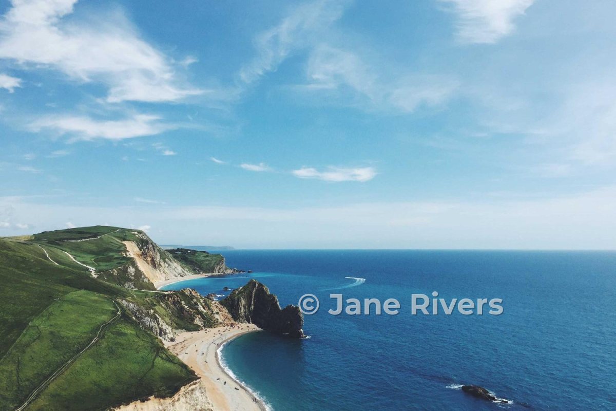
Here is the same text at 5%, 15%, 30% and 55% of the photo’s width. Each one uses an opacity that suits its size, because a bigger watermark needs to be fainter to keep the photo readable.

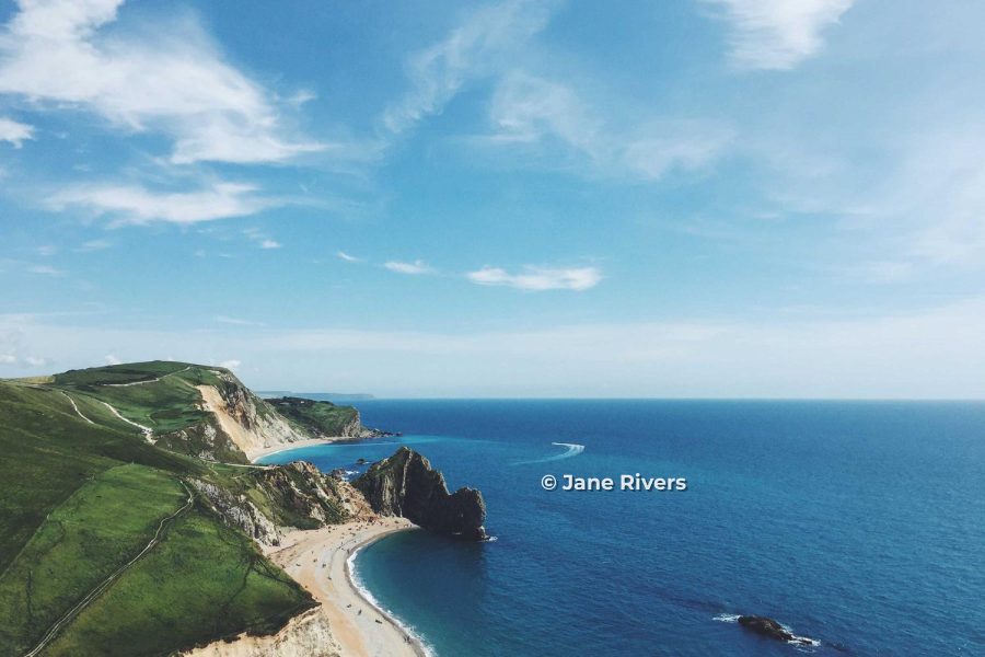
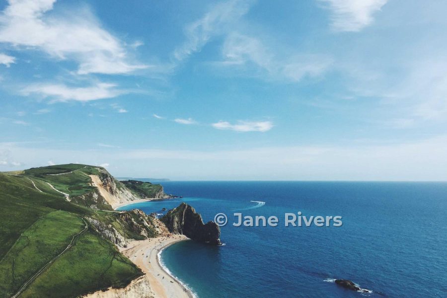

None of these is wrong on its own — they do different jobs. The 15% version is a signature for credit. The 30% version sits over the subject and makes cropping pointless. The 55% version is a proof mark. What goes wrong is using the wrong size for the job, or picking a size and forgetting to adjust the opacity to match.
Starting Sizes for Each Kind of Watermark
| Watermark | Width | Opacity | Why |
|---|---|---|---|
| Corner credit (text) | 15–25% | 70–90% | Small, so it has to be solid to be read at all. |
| Signature | 20–30% | 70–90% | Script letters are small and thin for their width. |
| Logo mark | About 8–12% | 60–85% | A compact symbol has no letters to read, so it can be smaller. |
| Over the subject | 30–50% | 30–50% | Big enough that cropping it out means cropping the subject. |
| Center | 40–60% | 30–50% | Covers the middle of the frame, so it must be see-through. |
| Diagonal | Most of the diagonal | 30–40% | Touches every part of the photo. |
| Tiled | Small copies | 20–30% | Dozens of copies add up, so each one stays small and faint. |
These match the ranges in where to put a watermark and how transparent a watermark should be. Treat them as starting points: a busy photo can take a slightly larger mark, a minimal one a smaller mark.
Size and opacity are one decision, not two. Think of it as visual weight: a small, solid watermark and a large, faint one can draw roughly the same amount of attention. When you make a watermark bigger, bring the opacity down; when you make it smaller, bring the opacity up.
Check It at Phone Size
You choose a size while looking at a large preview. Most people will see the photo far smaller — in a feed, a search result or a grid of thumbnails. Both photos below were shrunk to 320 pixels wide, about the size of a thumbnail on a phone, and enlarged again to show what survived.


The smaller watermark is still there, but it is no longer a name — it is a smudge. The larger one reads clearly, and at full size it is still modest. If a corner credit is meant to be read by people who find your photo on their phone, 12% is simply too small.
Before you export a batch, zoom the preview out until the photo is about the size of a thumbnail. If you cannot read the watermark, make it bigger or use a bolder font. Thin fonts fail this test first — see the best fonts for watermarks.
Where the Photo Will Be Seen Changes the Answer
The same photo can be seen full-screen on a laptop, as a card in a gallery, or as a tiny square in someone’s profile grid. The smaller it will be displayed, the larger the watermark has to be, relative to the photo, for anyone to read it.
| Where it is seen | Typical display | Sizing |
|---|---|---|
| Full-screen on your website | Large | The low end of each range is enough. |
| Portfolio or shop grids | Medium cards | The middle of each range. |
| Social media feeds | Phone width | The upper end — and check at thumbnail size. |
| Profile grids and search results | Small thumbnails | Only larger marks survive; small credits become smudges. |
| Client proofs | Laptop or phone | Large on purpose — the mark should be obvious. |
If one set of photos goes everywhere, size for the smallest place it will appear. A watermark that reads in a thumbnail will read everywhere else; the reverse is not true. If you prepare separate exports for different places — a clean-ish version for your own site, a more obvious one for social media — each can have its own template.
Instagram adds its own crops on top of this: a watermark near the edge of a post can be trimmed off in the profile grid, however big it is. How to watermark photos for Instagram covers the safe area.
Logos and Signatures Size Differently
Width is a good measure for text, because text has to be read letter by letter. A logo mark does not: once people know it, they recognize it as a shape. A simple mark can be noticeably smaller than a line of text and still do its job.


Signatures go the other way. Script lettering is small and thin for the space it takes up, so a signature usually needs more width than a typed name to read as clearly — see signature watermarks. And if your logo includes small text, size it like text: that small text still has to be legible.
Batches With Different Shapes
Real batches are rarely uniform. A wedding or a product shoot mixes landscape and portrait photos, and sometimes crops and resolutions too. Because every size here is measured against the width, a watermark that is 25% of a landscape photo’s width is a smaller share of a tall portrait photo’s area — it can look slightly lost at the bottom of a vertical frame.
- Check one of each shape. Look at your watermark on a landscape and on a portrait photo before exporting the batch.
- Fine-tune the exceptions. In Watermark.ws, when you change a watermark on one photo, you can apply the change to just that photo or to every photo in the batch.
- Split very different sets. If half the shoot is portrait and half landscape, two batches — each with its own template — are often simpler than adjusting photo by photo.
Setting the Size in Watermark.ws
- Add your text, logo or signature and drag it roughly into position.
- Size it on the preview. Use Text Size for text, or drag a corner handle to resize any watermark, until it covers the share of the photo you want.
- Set the opacity to match the size using the table above.
- Zoom out and check it at thumbnail size.
- Apply it to the batch and save it as a template. Each photo gets the watermark at the same proportion when you download.

Sample photos: Coastline by Rob Bye, New York street by Matthew Wiebe, Misty forest by Orlova Maria, Shop interior by Clark Street Mercantile on Unsplash.