
On this page
Why a Diagonal Works
A horizontal watermark across the middle of a photo protects one band of it. Crop above or below that band and a usable image is left. Tilt the same watermark and it now runs from low on one side to high on the other, crossing the top, middle and bottom of the frame at once.
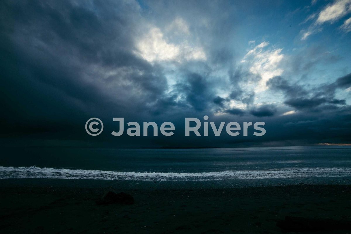
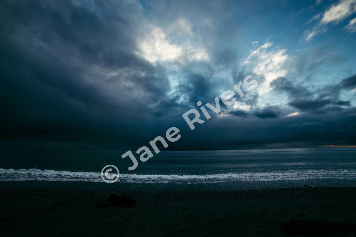
The tilt helps in two more ways. Most photos are built on horizontal and vertical lines — horizons, buildings, doorways — and a level watermark lines up with them, which makes it look like part of the scene. An angled one crosses those lines instead, so it reads as a deliberate mark. And because it runs over sky, water and land in one stroke, it crosses several different textures, which makes it harder to paint out cleanly. See can watermarks be removed for why that matters.
Which Angle?
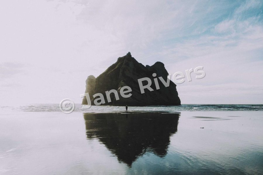
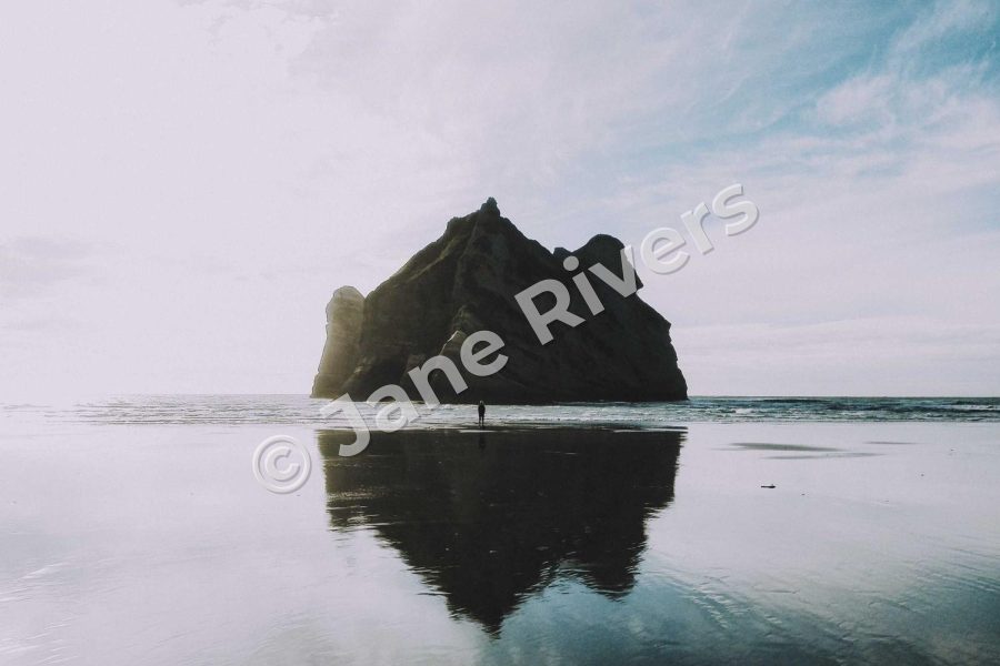
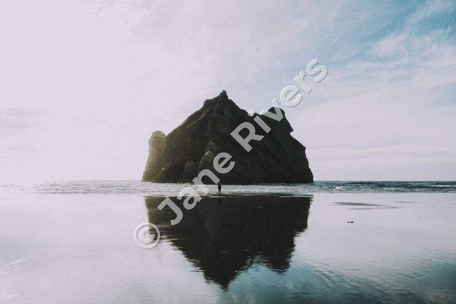
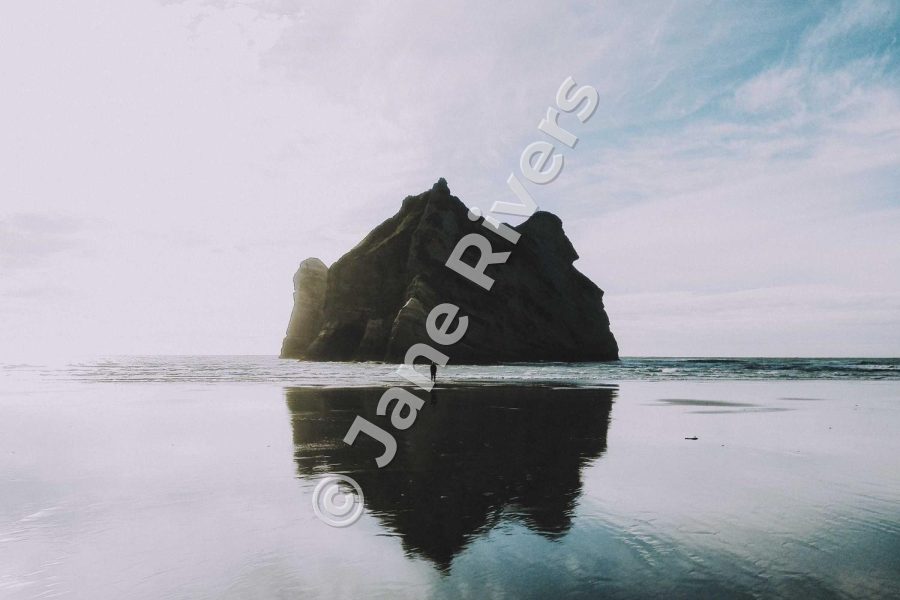
Between about 30° and 45° is the comfortable range. A slight tilt of 10–15° looks like a mistake rather than a choice. Past about 50° the text starts to read like a vertical sign, and people tilt their heads to read it. Within the range, a shallower angle is easier to read; a steeper one covers more of the height of the frame.
Corner to Corner Depends on the Frame
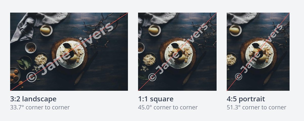
The most satisfying diagonal runs exactly from one corner to the opposite one. The angle that takes depends only on the shape of the photo:
| Photo shape | Corner-to-corner angle | Common for |
|---|---|---|
| 3:2 landscape | 33.7° | Most cameras |
| 4:3 landscape | 36.9° | Many phones |
| 16:9 landscape | 29.4° | Video frames, wide crops |
| 1:1 square | 45° | Square posts |
| 4:5 portrait | 51.3° | Tall social posts |
| 2:3 portrait | 56.3° | Portrait-orientation camera photos |
That is why one fixed angle cannot be exactly corner to corner on every photo in a mixed batch. A landscape set and a portrait set each have their own natural diagonal. If the look matters to you, check one of each shape, and split them into separate batches if they need different angles. The steeper portrait angles are also a little harder to read, so on tall photos many people settle for about 45° rather than going exactly corner to corner.
Rising or Falling?
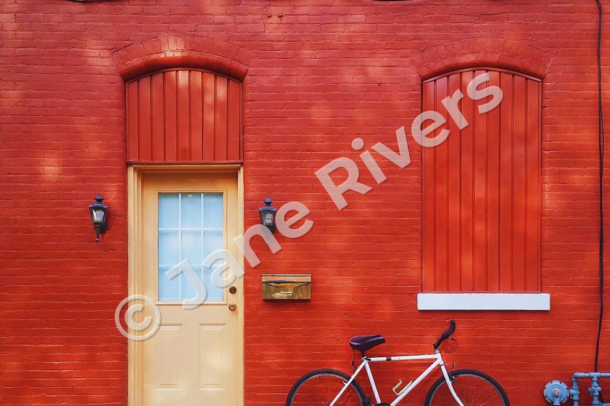
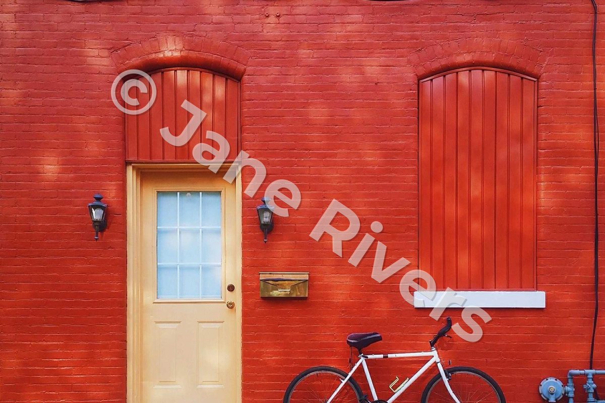
A rising diagonal — bottom-left to top-right — is the common choice. The text still reads left to right, and the eye travels up it naturally. A falling diagonal is just as protective and can suit a photo whose own lines run the other way, but it tends to look more like a stamp than a signature. Whichever you choose, use the same direction on every photo in a set so the collection looks consistent.
Three Ways to Go Diagonal
“Diagonal watermark” can mean three different things. Here they are on the same photo:

Best for: Portfolio previews and images you want protected but still enjoyable.
A single large diagonal. One copy of your name or logo, running most of the way across the frame at 30–40% opacity. No crop removes it, and it reads as a single, calm mark.

Best for: Stock previews, digital products and anything sold online.
Diagonal tiles. Many small, rotated copies in a pattern across the whole photo. The strongest protection, because every part of the image carries a mark. Tiled watermarks covers spacing and density.

Best for: Client proofs and previews that must look unfinished.
Diagonal lines. Two thin lines crossing corner to corner, usually with a level watermark in the middle. It keeps the text easy to read while making the photo unmistakably a preview — the look of a proof. How to watermark client proofs shows it in a full workflow.
Fitting Text and Logos to a Diagonal
A diagonal is a long, narrow space. What you put in it decides whether it looks designed or crammed.
- One short line works best. “© Jane Rivers” fills a diagonal gracefully. A name, a tagline and a web address stacked into three rotated lines turn into a block that is hard to read at any angle.
- Let the length set the size. A short name stretched corner to corner becomes very tall. If the letters start to feel heavy, let the watermark run about two-thirds of the diagonal instead of all of it — it still cannot be cropped out.
- Capitals or lowercase both work. Spaced capitals look calm and even at an angle; mixed case is quicker to read. Avoid scripts with very thin strokes, which break up once rotated.
- Think twice before rotating a logo. Many logos are designed to sit level and look odd tilted. A level logo in the center with diagonal lines behind it, or a tiled pattern, often looks better than a rotated mark.
Opacity matters more on a diagonal than almost anywhere else, because the watermark crosses the whole frame. Around 30–40% keeps the photo readable underneath; much higher and the diagonal becomes the first thing anyone sees. The reasoning is in how transparent a watermark should be, and the color choice — white, dark, or white with a shadow — in what color a watermark should be.
When a Diagonal Is the Right Choice
| The photo is… | Diagonal? | Why |
|---|---|---|
| A proof or preview before payment | Yes | It cannot be cropped, and it looks unfinished. |
| A stock or print preview | Yes, or tiled | The clean file is what people pay for. |
| A high-value photo you post publicly | Often | Protected, but the photo is still enjoyable. |
| A portfolio piece | Sometimes | A faint diagonal can work; a heavy one gets in the way. |
| A social media post | Rarely | Credit matters more than protection there. |
| A product photo for a marketplace | No | Many marketplaces restrict watermarks on product images. |
For the product photo rules, see watermarking product photos. For photos where you only want credit, a smaller mark in the right spot is usually enough — see where to put a watermark.
Keep a Diagonal Readable
- Keep the text short — “© Jane Rivers”, not a full sentence.
- Use a medium or bold font; thin strokes break up at an angle.
- Stay between about 30° and 45°.
- Keep a large diagonal at around 30–40% opacity.
- Add a soft shadow if the line crosses both bright and dark areas.
- Tilt it only slightly — 10–15° looks crooked, not deliberate.
- Go so steep that people tilt their heads to read it.
- Run it straight across faces when a slightly different line avoids them.
- Mix rising and falling diagonals within one set.
- Make a single diagonal solid — at full opacity it hides the photo.
Making a Diagonal Watermark in Watermark.ws
-
1
Add your watermark
Add a text or logo watermark and choose a sturdy font.
-
2
Rotate it
Drag the rotate handle on the watermark to the angle you want. Straighten Angle sets it back to level, and Move to Center centers it on the photo.
-
3
Size it and set the opacity
Drag a corner handle until it runs most of the way across the frame, and bring the opacity down to around 30–40%.
-
4
Or tile it
Turn on Tile to repeat the watermark across the whole photo — every copy follows the angle you set.
-
5
Or add diagonal lines
Turn on Diagonal Lines to draw two lines from corner to corner, with their own color and opacity.
-
6
Apply it to the batch
Apply it to every photo, check one landscape and one portrait photo, and save it as a template.
Sample photos: Canyon hoodoos by Drew Hays, Rock reflection by Rosan Harmens, Table setting by Annie Spratt, Red wall by Brennan Ehrhardt, Stormy sea by Patrick Fore, Buildings from below by Jean-Marie Grange on Unsplash.