
On this page
- What Makes a Font Work as a Watermark
- 10 Popular Fonts, Tested on the Same Photo
- The Shrink Test: Thin Strokes Disappear First
- Busy Backgrounds Punish Thin Fonts
- Thin Fonts Are Also Easier to Remove
- Capitals and Letter Spacing
- Pair a Personality Font With a Plain One
- Match the Font to Your Work
- Watermark Font Checklist
- A Note on Font Licensing
- How to Set Your Watermark Font in Watermark.ws
What Makes a Font Work as a Watermark
A watermark font has a harder job than almost any other text. It sits on a background you do not control, usually at reduced opacity, and every platform that shows your photo shrinks it — into a feed, a grid thumbnail, a link preview. A font that looks beautiful in the editor can turn into a faint smudge by the time anyone sees it.
So the best watermark fonts are not the prettiest ones. They are the ones that still read as your name after all of that has happened to them.
- For protection and readability: a medium or bold sans-serif such as Montserrat, Oswald or Open Sans.
- For a premium, classic look: Cinzel, or a serif used large.
- For a personal signature: a script with some weight to its strokes, like Kaushan Script or Great Vibes — never a hairline script.
- Whatever you pick: check it at thumbnail size, and add a shadow, stroke or background on busy photos.
10 Popular Fonts, Tested on the Same Photo
Every font below is in the Watermark.ws preset library. Each one is set to the same text, the same width, 90% opacity and the same soft shadow, on the same photo — a mix of sky, granite and dark trees, which is roughly what a watermark has to cope with on a typical landscape.

Wide, even strokes that survive shrinking, low opacity and busy backgrounds. The safest all-round choice.

Tall and narrow, so a long name fits in a small space. At its best in capitals.

Neutral and extremely legible. A good fit when the watermark should inform rather than decorate — products, listings, documents.

Based on Roman inscriptions. Looks premium on landscape and fine art work without giving up legibility.

Handwritten personality with thick brush strokes, so it holds up far better than most scripts when it is small.

Elegant when large, but its hairline serifs thin out when the watermark is small or faint.

The classic wedding and portrait signature. Give it size, and a shadow or stroke on busy photos.

Very readable, but casual. Great for lifestyle and food creators; it can undersell fine art or corporate work.

Beautiful as a small second line under your name. Too light to carry a watermark on its own.

A single hairline stroke. Delicate at full size, and gone almost everywhere else — see the shrink test below.
The pattern is consistent: what decides whether a font works is not whether it is script, serif or sans-serif, but how thick its strokes are. A heavy script beats a thin sans-serif, and a thin script loses to everything.
The Shrink Test: Thin Strokes Disappear First
Here is the same photo with two watermarks of the same width — a thin script and a bold sans-serif. Both were shrunk to 240 pixels wide, about the size of a photo in a profile grid or a marketplace thumbnail, and then enlarged again so you can see what survived.
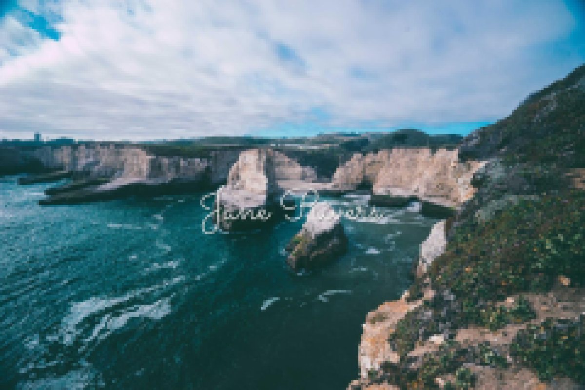

When an image is scaled down, each pixel becomes an average of the pixels around it. A stroke that is two pixels wide at full size ends up as a fraction of a pixel, blended into the background. Thick strokes have enough width to survive the averaging, so the letters stay letters.
Before watermarking a batch, zoom the preview out until the photo is about the size of a phone thumbnail. If you cannot read your name, nobody else will either.
Busy Backgrounds Punish Thin Fonts
Detailed backgrounds — buildings, foliage, water, crowds — are full of small lines and edges. A thin font is made of small lines too, so it blends straight in. Below, the same text at the same size and opacity, set in a formal script and in a bold sans-serif.


That does not mean you have to give up a script if it is part of your brand. You just have to separate it from the background. Any one of these three fixes works:



Shadow, stroke and background are all built into Watermark.ws text watermarks, each with its own color and strength, so you can set them once and apply them to the whole batch.
Thin Fonts Are Also Easier to Remove
Readability is only half of it. A watermark protects a photo by covering detail that someone would have to rebuild to remove it. Zoom in on the two watermarks below and compare how much of the city each one actually covers.


The hairline script leaves almost everything behind it intact, so a clone brush or an AI removal tool only has to repaint a few thin lines. The bold letters hide whole windows and edges, and rebuilding those convincingly is much harder.
Font weight is not the whole story, though. Where the watermark sits matters even more — a bold watermark in a corner is still gone after one crop. See where to put a watermark on a photo for how placement and protection fit together.
Capitals and Letter Spacing
Widely spaced capitals are the look of luxury brands and fashion magazines, and they work well for watermarks too. Spacing makes a lighter weight feel deliberate, so the watermark can be smaller and calmer without looking weak.


Two rules keep it readable. Only space out capitals — spaced lowercase letters fall apart into separate shapes, and script fonts are designed to connect, so they should never be spaced at all. And keep spaced, lighter text for calmer areas of the photo or for a second line; on a busy background, the gaps give the detail even more room to swallow the letters.
Watermark.ws has a letter spacing control on every text watermark, next to the font style buttons.
Pair a Personality Font With a Plain One
Many photographers use two lines: their name, and a second line with what they do or their website. The easiest way to make that look designed is to give each line a different job. One font carries the personality. The other is plain, small and quiet.



Avoid pairing two scripts or two decorative fonts — they compete with each other and with the photo. In Watermark.ws, add each line as its own text watermark so each one can have its own font and size, then save the pair as a template to reuse it on every batch.
Match the Font to Your Work
A font also says something about the photos it sits on. Use these as starting points:
| Your work | Fonts that fit | Why |
|---|---|---|
| Weddings and portraits | Great Vibes, Playfair Display Italic | Romantic and personal. Pair with spaced capitals to keep it readable. |
| Landscape and travel | Cinzel, Montserrat | Timeless, and strong enough for skies, water and foliage. |
| Wildlife and sports | Oswald, Montserrat | Bold and compact, so it sits beside a detailed subject without fighting it. |
| Products and e-commerce | Open Sans, Montserrat | Clean and neutral. The product stays the hero. |
| Real estate | Open Sans, Oswald | Readable in small listing thumbnails, and looks professional. |
| Stock previews and proofs | Montserrat Bold | Heavy strokes are the hardest to remove, especially tiled or diagonal. |
| Social media creators | Kaushan Script, Pacifico | Personality that still survives being shrunk into a feed. |
Watermark Font Checklist
- Check the watermark at thumbnail size before exporting a batch.
- Choose regular, medium or bold weights for anything that has to protect the photo.
- Use one personality font and one plain font at most.
- Add a shadow, stroke or background on busy photos.
- Keep the same font on every photo so people learn to recognize it.
- Rely on hairline scripts or light weights for protection.
- Combine two scripts or two decorative fonts.
- Set a script font in all capitals — it becomes almost unreadable.
- Space out lowercase letters or script fonts.
- Use a font you do not have a license to use commercially.
A Note on Font Licensing
Every font in this article comes from Google Fonts and is released under the SIL Open Font License, which allows commercial use — including on photos you sell or deliver to clients.
Many fonts on free-font websites are free for personal use only. Watermarking client work, stock photos or product images is commercial use, so check the license before you upload a font you found elsewhere.
How to Set Your Watermark Font in Watermark.ws
- Add a text watermark and type your name, business or website.
- Pick a font. Choose from the preset fonts, or upload your own TTF, OTF or TTC file under Uploaded Fonts.
- Set the style. Adjust size, color, opacity, bold, italic and letter spacing.
- Separate it from the background. On busy photos, turn on Shadow, Stroke or Background.
- Save it as a template so every future batch uses exactly the same font and settings.

Want a handwritten signature instead of a typed name? See how to create a signature logo. And once your font is set, batch watermark your photos in one go.
Sample photos: Canyon by Philippe Wuyts, Yosemite valley by Christian Joudrey, Coastline by Joseph Barrientos, Canal by Linh Nguyen, City by Anders Jildén, Fjord by Alexey Topolyanskiy, Mountain camp by Wolfgang Lutz, Sunset field by Kenneth Thewissen, Brown bear by Thomas Lefebvre on Unsplash.