On this page
Why Drafts Get Used Before They Are Paid For
Most designers have a story like this: a client goes quiet after the first round of logo concepts, and a few weeks later one of those concepts shows up on their social media profile — pixel for pixel, never paid for, never finished. Sometimes it is deliberate. More often the client simply did not think of a PNG in an email as unfinished work.
A draft watermark fixes the second problem completely and makes the first one much harder. It tells everyone who sees the file — the client, their business partner, the nephew who “knows Photoshop” — that this is a concept for review, and who it belongs to.
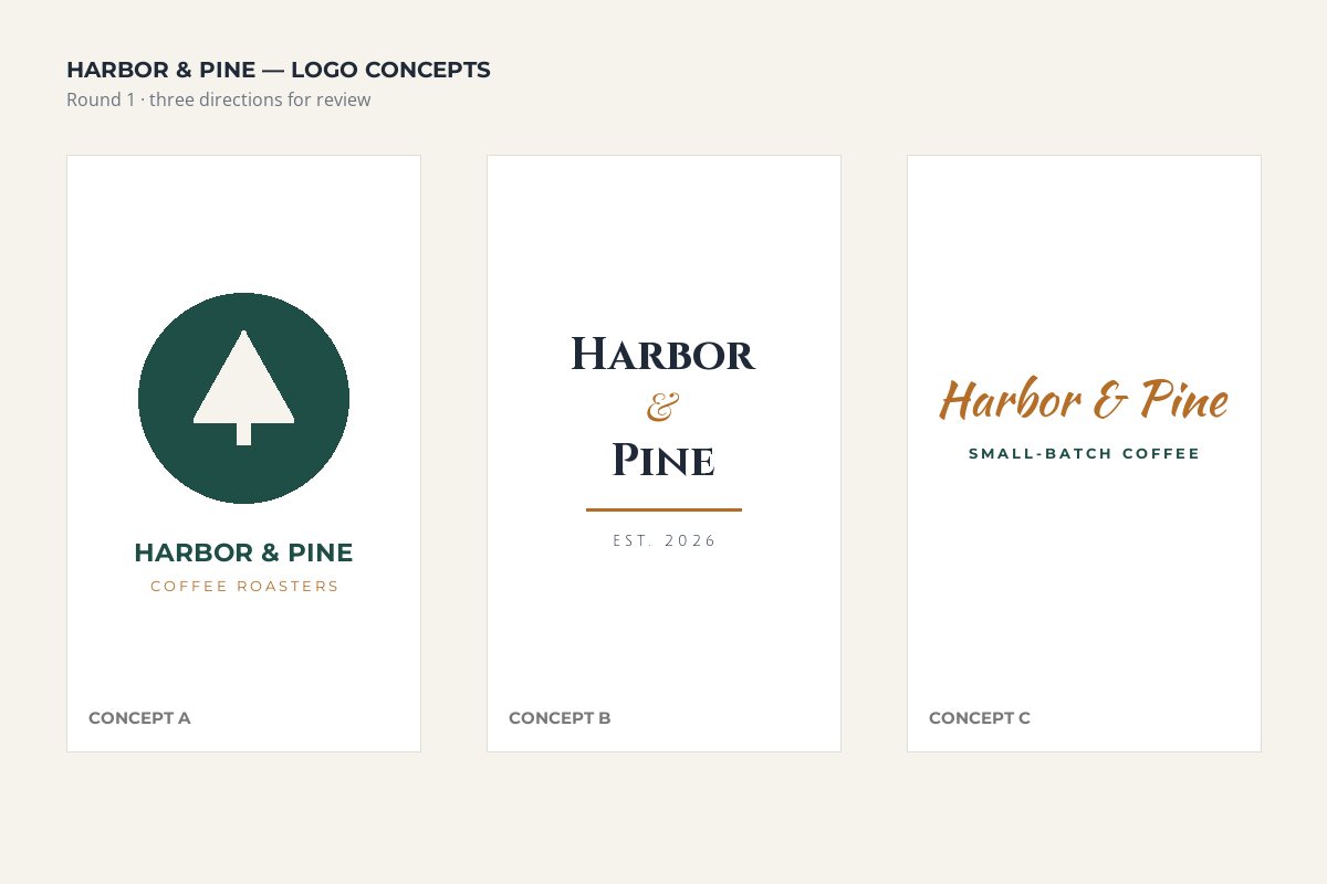
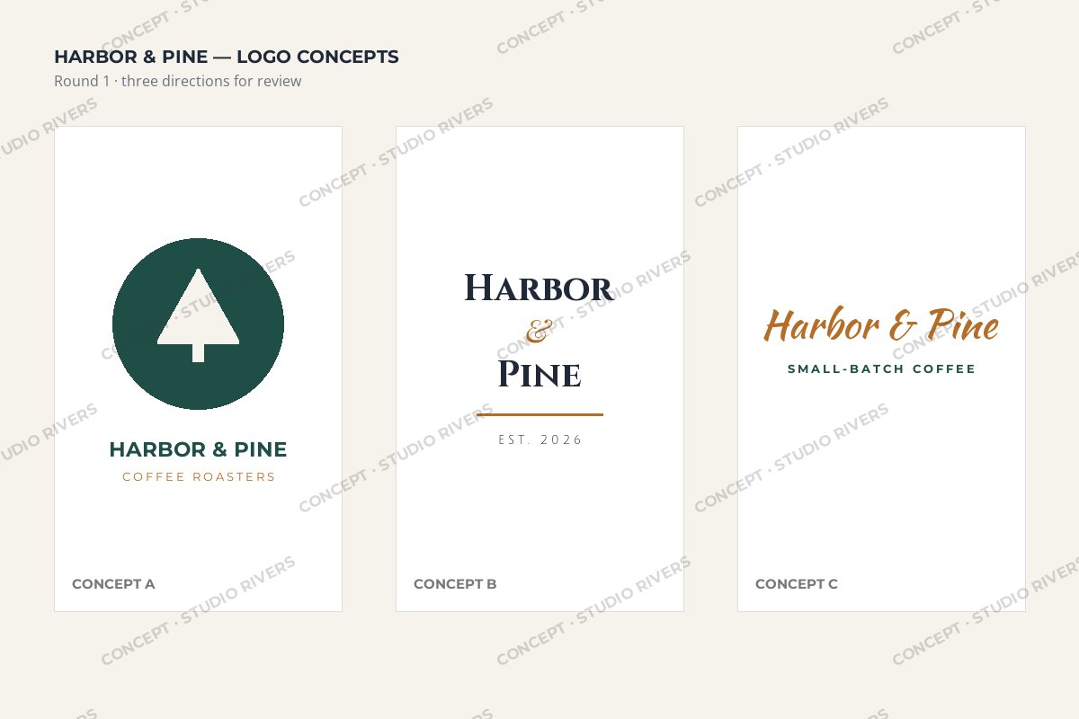
The marked board on the right is just as easy to review. But any logo cut out of it carries the studio’s name and the word CONCEPT, which makes it useless as a finished asset — and makes it obvious where it came from if it turns up somewhere it should not.
State in your agreement that concepts remain yours until the final invoice is paid, and that only the chosen, delivered files may be used. The watermark makes that rule visible on every file.
Three Ways to Mark a Concept
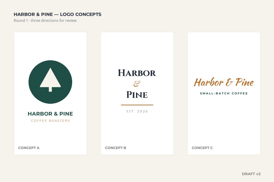
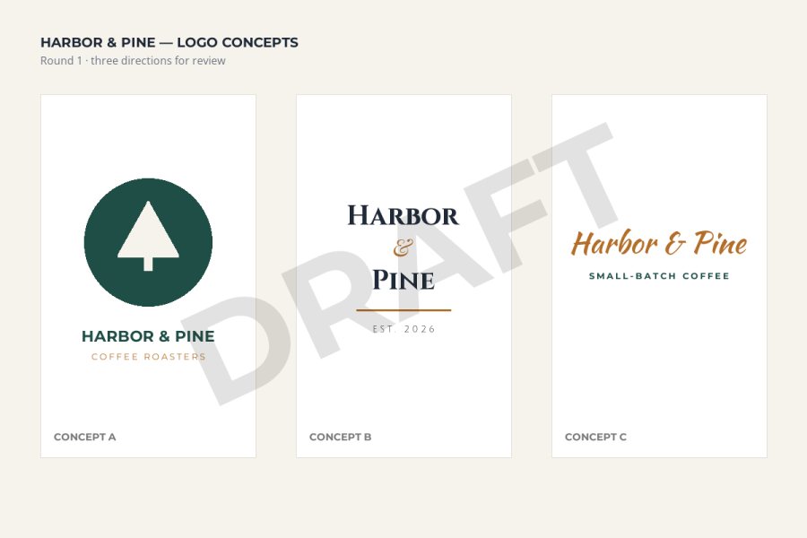
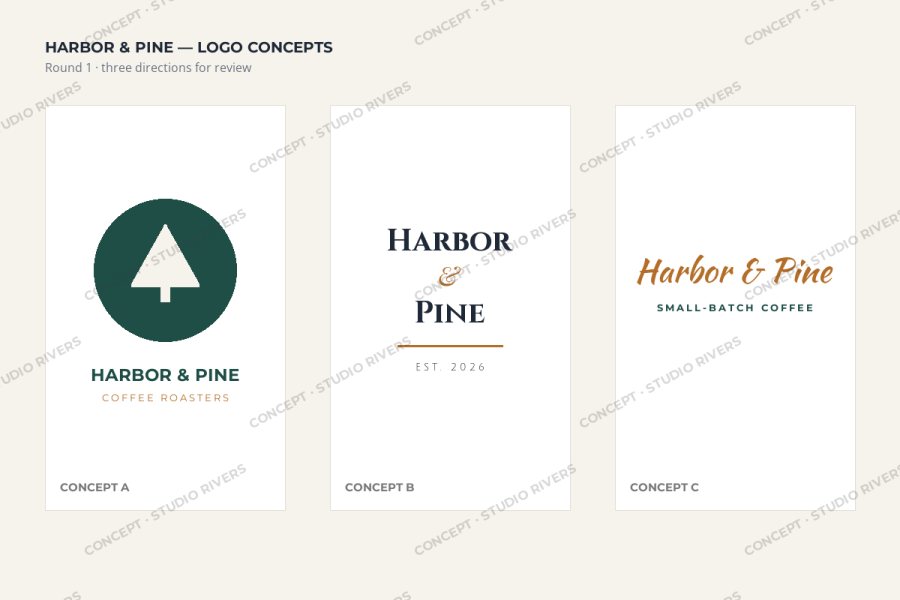
For concept boards, a light tiled mark is the one that actually works. A board usually shows several logos side by side, and a single mark only protects the one it happens to cross. Tiling puts a copy over each concept and in the space between them, so there is no clean piece to cut out.
Keep the text short — “CONCEPT · STUDIO NAME” is plenty — and the opacity low. The tiled watermarks guide covers spacing and angle in detail; the only difference for design work is that you want the pattern to sit behind the work, not on top of it.
Keep the Work Readable for Feedback
Photographers mark proofs so clients can pick favorites. Designers need more than that: the client has to read headlines, check colors against their brand, and notice that the button text is wrong. A watermark that hides detail does not just annoy them — it produces worse feedback.
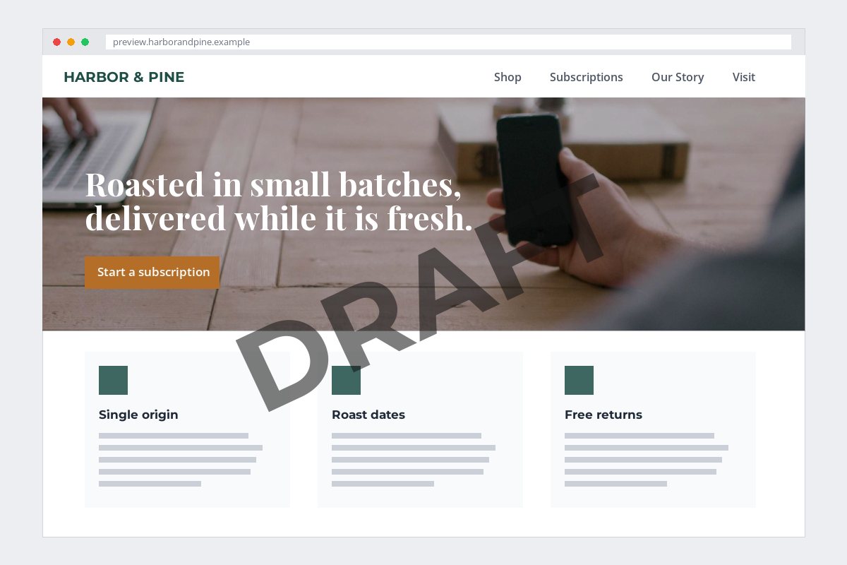
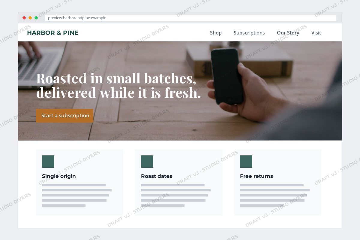
The heavy stamp covers the headline, the call to action and one of the feature cards — exactly the parts a client needs to comment on. The light version protects the whole page just as well, because no part of it is clean, and it lets the client judge every element.
- Stay neutral. A gray or white mark does not change how the client sees your colors. A red DRAFT next to their brand palette does.
- Go faint. Around 12–20% opacity is usually enough on a light board. Check it on the darkest part of the design, too.
- Keep it off type. A thin mark crossing a headline is fine; a bold one sitting on body copy makes it hard to proofread.
Put the Version in the Mark
Design projects move through rounds, and old drafts have a way of coming back. A client forwards “the logo” to their printer, and it turns out to be round one. Adding the round and date to the watermark prevents that mix-up.
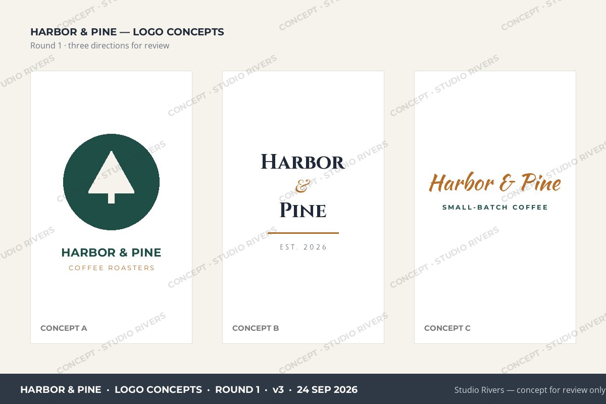
A useful label answers three questions: what project, which version and when. Anyone holding the file can tell whether it is current, and if an old concept ever surfaces in public, the label tells you exactly which file it was.
Watermark.ws can place more than one watermark on the same file. Keep the faint tiled mark and the version label as separate watermarks, save them as a template, and only edit the version text for each round.
Send Previews, Not Artwork
The watermark is one layer. The file itself is the other. A client does not need your source file or a print-ready PDF to approve a concept — a screen-sized image is enough. Here is the same part of the script concept, from the full artwork and from a 1,200-pixel preview of the board:
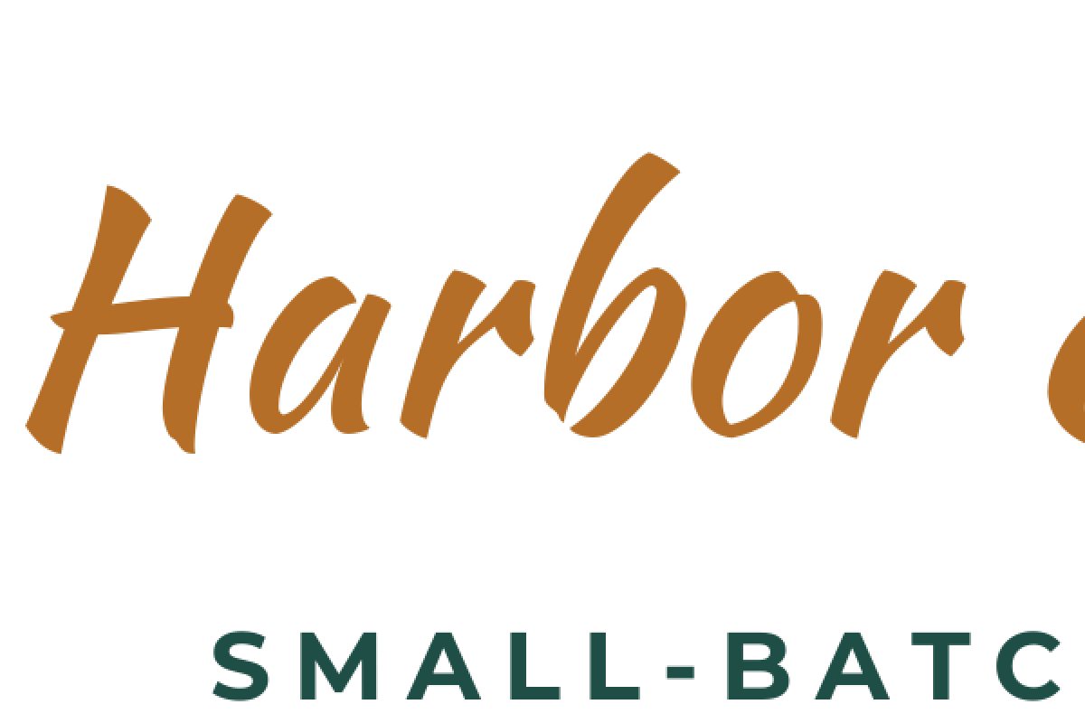

On screen, at the size the client views it, the preview looks perfect. Enlarged for a sign, a shirt or a printed menu, it falls apart. That makes the preview useless as a production file even if someone crops the watermark out.
| What you are sharing | Send | Keep back until paid |
|---|---|---|
| Logo concepts | A marked board as a JPG or PNG, around 1,200–2,000 px wide | Vector files (SVG, AI, EPS), transparent PNGs of each logo |
| Website and app layouts | Marked screenshots or a marked PDF of the pages | Design source files and exported assets |
| Print pieces | A marked, screen-resolution PDF or JPG | Print-ready PDFs with bleed and crop marks |
| Illustrations | A marked, screen-sized JPG | Full-resolution and layered files |
Watermark.ws has a Resize tool that sets the width and height in pixels or as a percentage, so you can shrink and mark a set of previews in the same pass. For documents, see how to watermark PDFs.
A Review-Round Workflow
-
1
Export the round
Export every board, page or mockup you want feedback on as an image or PDF at screen size.
-
2
Add the protective mark
A short text watermark such as “CONCEPT · STUDIO NAME”, with Tile turned on, a neutral color and low opacity.
-
3
Add the version label
A second text watermark with the project, round and date, placed along an edge where it does not cover the work.
-
4
Apply it to the whole round
When you apply a watermark, Watermark.ws asks whether it should go on just this file or on every file in the batch. Choose all.
-
5
Save it as a template
Save the batch settings, so the next round only needs a new version number.
-
6
Deliver the finals clean
Once the invoice is paid, send the chosen files unmarked and at full resolution — never a watermarked final.
Draft Watermark Checklist
- Mark every concept on a board, not just the board as a whole.
- Use a neutral color and low opacity so colors and type can be judged.
- Include the project, round and date.
- Send screen-sized previews, not source or print files.
- Put the ownership rule for concepts in your contract.
- Rely on a small corner label on a board of several logos.
- Stamp a heavy mark over headlines and calls to action.
- Use a bright color that clashes with the client’s brand palette.
- Send vectors or transparent PNGs before the final invoice.
- Watermark the final files the client paid for.
Sample photos: Designer’s desk by Jeff Sheldon, Coffee table by Jonathan Velasquez on Unsplash.